ActionTiles Support & Ideas Forum
Public Forum for ActionTiles Customers. Please use the Search Box and carefully browse the results to look for existing relevant Topics before opening a new Topic or Private Helpdesk Ticket.

 Tip: Simple Event logger graphs for Media Tile images
I'm using the SimpleEventLogger smartapp, currently dumping temperature data data into GoogleSheets (as I've been too lazy to set up a local DBMS until now). It dumps raw sensor data into a sheet and it looks like this

Note: When setting up Simple Eventlogger, under Other options there's "Include additional columns for short date and hour?" Be sure to turn that option ON as we'll need it. (that's column G in the screenshot above) To preserve space set "Delete Extra Columns?" ON as well and set archive type to Out of space. Once your sheet runs full, SimpleEventlogger will rename the sheet and start a new fresh sheet every blue moon, depending on your number of sensors and logging frequency.
Second step is to set up the =QUERY function in google sheets to pull out the last 24 hours.
Mine looks like this. It's a fugly hack but it works.. kinda:
=QUERY(RawData!B:G,"select B,C,D,F,G where C = 'temperature' and F >= date '"&TEXT(DATEVALUE(today()-1),"yyyy-mm-dd")&"'",1)
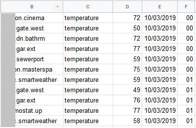
Third step is to split all the sensor data out into columns for each sensor and create an average datapoint for each sensor per hour. That's where column F above is important, as that's the hour. We need to average as some sensors might be spitting out temperatures every few minutes, so even if I configure your SmartApp only to scan every 30 minutes, it'll pick up all those past sensor readings (haven't quite figured out how to get around thaT)
Anyway, my pivotal thing looks like this:
=Query(B:F, "select F, avg(D) group by F pivot B format avg(D) '###,#0.0'")
As we are grouping by the hour number and the hour number will always be between 00 and 23, this query will always generate 24 rows, one for each hour, with the average temperature for each sensor in columns J-S. Graphing this is relatively easy and you should be able to figure that out on your own (it's the fun part) However, let me explain G and H below.
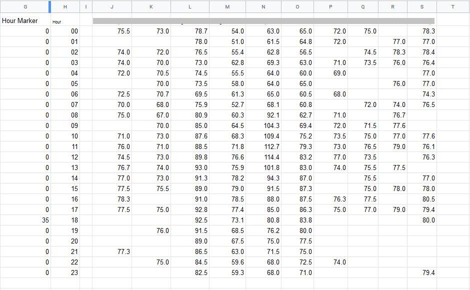
Column H is just a static list of numbers which indicate the hour. I use this to build the X-axis on the graph.
I wanted the graph to show an hour marker for the current hour as the graph does a cyclic update left to right, i.e. it's helpful to see where current time of day is on the graph. Next to the pivotal tables, I inserted the following formula in all cells G1-G24: =if($H2=hour(now()),$A$8,$A$10)
The formula contains a static reference (the $ stuff) to a couple of cells where I store the marker extents.
A8 contains the integer value 35 (the value to graph for the current hour)
A10 contains the integer value 0 (the value to graph for any other hour)
Graphing column G will then produce a little "spike" in the graph for the current hour, as shown by the yellow arrow below:
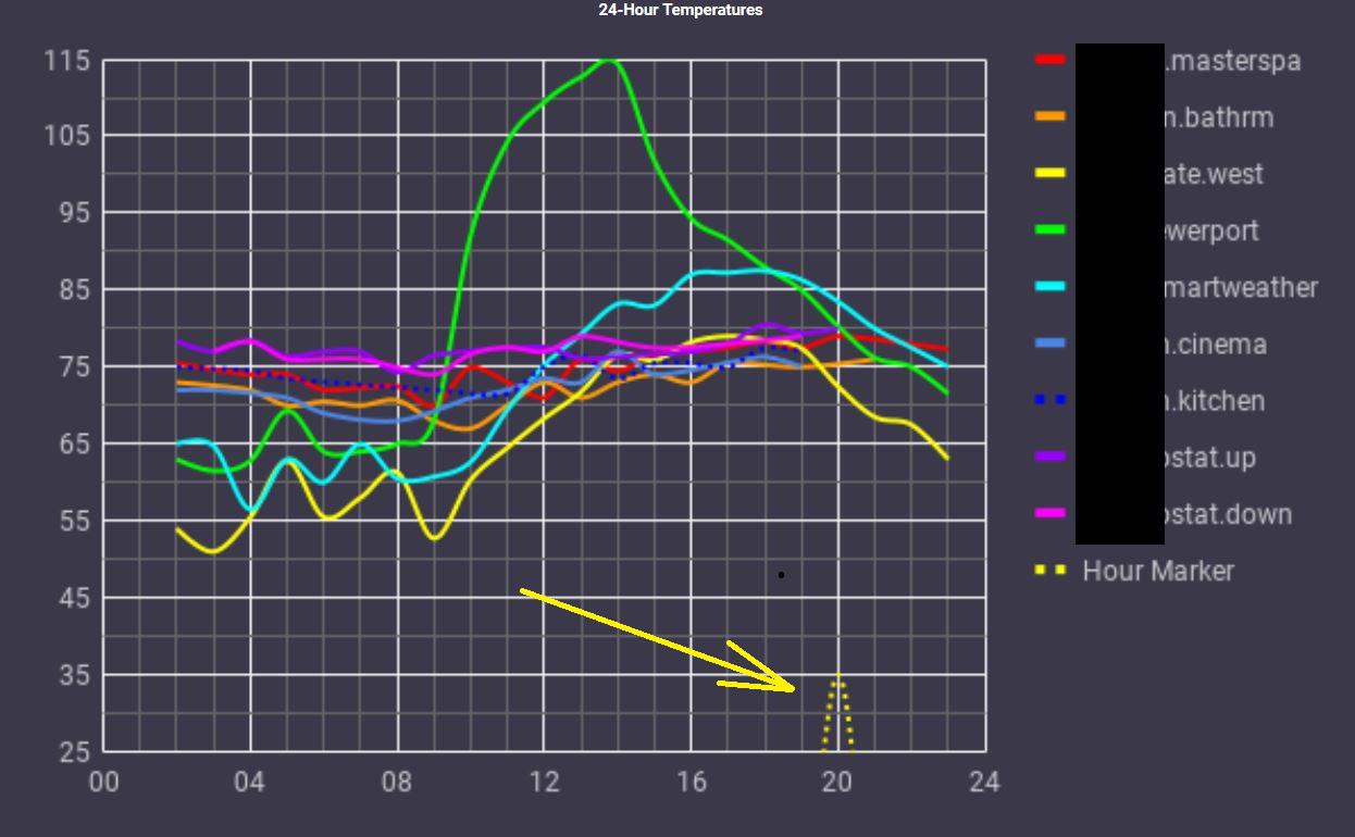
Note: for some reason mine is an hour ahead and even though I've set the timezone for the sheet, it's still borked...)
Once you got the graph running, all you need to do is publish it. Be sure to use the Image option under the Embed menu, as nothing else will work with AT. Copy the full URL from https:// to include format=image, but get rid of the iframe around the url.
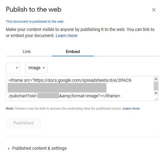
Create a new media URL in AT and paste it in. Set the update interval to your preference, I'm running mine at 1800 seconds (half hour) update intervals.
That's pretty much all I've done, yet full disclosure it's not completely working as it's supposed to. Sometimes the graphs re-arrange themselves without prior consent from me. Some sensors just seem to drop off the graph even though there's still data for them. No idea why this happens yet, So there's still a few kinks to be worked out, yet I hope this is useful to some of you.
/Max

 Tracking, Trending, and Graphing data from an Owlet for Smartnursery?
I'm looking for a way to integrate our Owlet monitor into our Smartnursery. For those who are unaware, an Owlet is a small monitor that fits on a newborn's foot to monitor body temperature, motion, etc. when a parent is in another room/away, and can send alerts to smart phones. Our twins are medically fragile, as they came a little early, so tracking medical data may prove useful if provided to a doctor. I would love to see a way to receive the data from the Owlet base and then plot on a timeline and store the data for a tile. I've seen Python scripts on Github that are simple graphing/data storage methods, so I was wondering if anyone else had any experience or ideas with this!
Customer support service by UserEcho
