0
Closed
RELEASE v6.9.2: Big Glass UI replaces slide-up drawers for PIN, Dimmer, Light Color, Routines, SHM, etc.
Terry (ActionTiles) (Co-Founder) 7 years ago
in Announcements / Release Notes
•
updated 7 years ago •
19
Minor Release:
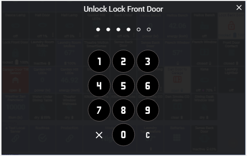
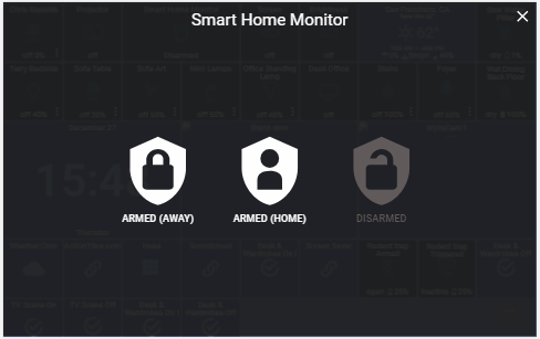
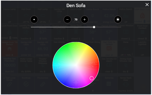
- Feature: For Tiles with extra controls (like PIN Protected, Dimmers, Color, SHM, Routines, and Modes), the control "slide-up drawers UI" has been replaced with a big pop-up full-screen "Glass UI".
To dismiss any Big Glass Pop-Up, tap the "X".
On wide screens, you can dismiss with the swipe-away gesture: UP or DOWN in the margins of the screen (i.e., you can only swipe-away on the left or right area outside the space occupied by the controls - this means that swipe-away is not possible on narrow screens - use the "X" instead.


- Note: In this Release the old PIN Code implementation is unchanged for Valve, Momentary, and Image Capture Tiles. The design of these Tiles will be updated soon to match the others.
- Thermostat overflow options are not yet using this new Glass UI.
- Bug Fixed: Color bulb indicator on Switch Tiles for HSV lights should now indicate the correct color.
Enjoy!
Please contact Support@ActionTiles.com if you encounter issues. Thank-you.
Commenting disabled
Customer support service by UserEcho


That''s a nice upgrade. If I may be a bit picky, I find the UI for 'Mode' a bit out of keeping with the big bold designs of the PIN entry screen and the SHM modes. I know I only have the default three modes and you may have to allow for dozens, but it still seems a bit incongruous to see text barely any larger than my tile headers on a vast empty screen.
Thanks for the feedback, Orange...
Alex hates it when I suggest a Feature Request on behalf of Customers, but I observe that SmartThings Classic App uses a grid of Tiles for Routines - and the new App also uses multiple columns uf there is room. We might consider something like that in order to take advantage of the available space in the full screen Glass.
But we really want to let the current design (the whole Release actually) soak in the wild for a while and see what variety of feedback comes in. Thanks for starting out though!
My observation would be that the essence of the ActionTiles UI is that it is a grid of tiles. So when I press a tile and the square tiles aren't there any more it throws me a bit (not necessarily a bad thing).
Not only was I rather anticipating the location modes appearing like a group of tiles (maintaining the normal/accent highlighting to show the current mode), I was expecting the same for the SHM modes and a 3x4 group for the PIN entry.
Thanks for the feedback.
We are tracking all feedback that the users provide and we are always looking for ways to improve the product.
For Glass UI we wanted to do something that's less "square" then the rest of the Tile interface, it's meant to feel very different.
Your point about the mode list is valid. I will consider it.
Terry, I don't know about other users, but my wife hated using the previous pin code entry screen for disabling the alarm. So much so that I had to install a stand-alone Iris keypad. This latest upgrade is a total game changer! She (me as well) loves the new Action Tiles keypad. This seemingly minor change to a really great product has totally changed my wife's opinion of the alarm system. Thanks to you and your team for incorporating this change!
Thank-you, BA577, for reminding us that "little things" can make a big difference!
When we review Feature Requests, some don't seem as valuable (from our perspective) as others, especially in proportion to the development effort required. But hearing a success story like yours is gratifying. Thank-you!!!
It's even more important for compliments to be scene by potential new Customers...
If you get a chance and not too much of an imposition, please consider a tremendous favor to us...
We need 5-Star Ratings / Reviews / Recommendations on Facebook, Play Store, and Amazon Appstore.
The value of sincere and enticing endorsements is priceless! Remember: Just a rating isn't as valuable as a short paragraph.
Thank-you tremendously,
Happy New Year!
...Terry.
Ditto! My wife and I are much happier!
Much appreciated. As my wife is the first one up on weekday mornings, she like the new pin pad very much.
Thanks for the update, the new UI is really nice.
One thing that seems to have changed though is I no longer get a prompt when I try to open or close a door lock or garage door. Previously, it would pop up a confirmation to make sure I really wanted to trigger them, which was really nice to avoid accidental taps. Is that feature gone? I don't see an option in Tile Settings or Tile Security.
The confirmation was removed by popular request.
We can't make everything a custom option as it would seriously bloat the product.
Add PIN protection to the Tile if you need an intermediary step fit confirmation.
Hmm, okay. Fair enough. Maybe I'm in the minority there, but I did like the confirmation. I don't need or want a PIN - I just liked the protection from accidentally tapping, which is pretty easy to do on a phone.
I’ve had 3 instances of my garage opening in my pocket because of the prompt removal. I was forced to add a PIN to prevent this.
I on the other hand love that the conformation was removed. I don't really utilize ActionTiles on my phone, but have 3 Fire 10 tablets running in different places in my house. For me the conformation was an unwanted step.
This option is gone for now. However, a new tile security "confirmation" mode will be added in the near future.
Meanwhile, please add a PIN Code to the sensitive tiles to prevent accidental triggers.
The thermostats still have "slide-up drawers". Are those going to be updated as well?
Yes.
The larger PIN Code entry screen is great on most of my devices, but there is an issue on my iPad. There, we wonly see the bottom row of the Pin Code screen. Is there a simple setting to fix this?
Please follow this Bug Report: https://support.actiontiles.com/communities/12/topics/5462-v672-glass-ui-broken-functionality-on-older-ios-devices