
RELEASE v6.7.2: Major style-engine changes as foundation for more customizability. Many polishes and improvments!
Major release!
This is a big one, folks...
As you know, the ability to customize Panel "styles" is a very popular wish-list item. This update only offers a few more customer-facing controls for styling; but it updates the underlying Style-Engine subsystem as a powerful new foundation for future customization abilities. You will immediately see a change in the appearance of various elements the Tiles on your Panels (and some behavior changes too). Themes have been improved and have previews. We will soon add color customization.
ActionTiles Facelift...
All Tiles are resizable (new: weather, thermostat, music player, blank, mode).
New icon selection for Switch, Contact, Presence, Panel, Momentary Switch, Valve, Shortcut, Motion. Halloween icons for Switches. Boo!
Introducing “Tile Intentions”. Chose individual Tile appearance based on Thing state. Chose from Info, Normal, Accent and Warn Intentions.
Preferences for Tile Size, Tile Header, Footer and Tile Content, Tile Spacer and Tile Corner Radius.
Added Panel Style Page that now contains Panel appearance preferences.
Added Tile samples to preview Panel Themes.
Added 8 new themes. New themes are High Visibility variants of existing themes.
Improved Panel Layout
Improve initial Panel drawing animation.
Improved Tile layout, fonts and icons are size optimized for viewing. Tile Content scales with Tile Size.
Tile Header and Tile Footer are now center aligned.
Panel Tile is now an anchor rather than button (improved navigation, support for right click, middle click, shift+click, etc).
Numeric Tile values are rounded off to the maximum of 2 decimal places.
Some redundant header/footer elements are removed.
Tile Overflow button pushed towards the edge of the Tile.
Improved consistency between Tiles.
Tile Spacer is applied around Tilesets.
Tile Changes
Thermostat Tiles lost Humidity value, added Fan Operating State instead. If required, humidity Tile can be added separately, because humidity is not a standard Thermostat property.
Thermostat Tile support setpoint changes by 0.5 degrees (new Tile preference).
The bottom drawer of Music Player shows controls dynamically based on current state of the player.
Battery icon in Tile footer will not display the numeric value anymore and will not be highlighted when battery is low (improves GUI consistency, aim is to make Tiles more streamlined). Users are welcome to setup a Panel dedicated to battery statuses.
Added battery icons to more Tile footers, where applicable.
New icons for CO, Motion Sensor, Momentary Button Tiles.
Added support for CO2 (carbon dioxide) Capability.
Power, Energy, Illuminance, CO2 Measurement's unit of measure is moved to the footer, because there is no space alongside the value.
Performance
Faster loading time. Reduce memory usage.
Improve Media Tile initial loading.
Miscellaneous
Removed auto-focus on input fields throughout the app
Panel Builder shows Tile dimensions.
Removed Toast Notification when changing Panel Preferences. Changes are saved transparently.
Location Viewer renamed to Location Inventory.
We will update various open "Bug & Idea Topics" soon if their status has been affected.
Thank-you!!!
...Terry & Alex
Answer

This update has made a 3x1 clock useless. Can you add the option to increase the size of this individual tile so it fills the space?
Also I understand you removed the battery value to make it look better but that should be a user preference. I like to see the percentage instead of an icon that gives barely no info. Most of my tiles are just empty space now because I don't need the font so large.

Thanks for the feedback, Nick ... you win first post trophy 🏆 😉!
You make good points; We're going to carefully track feedback over the next few days to figure out if there's going to be any urgent tweaks to deploy. Other touches will go through our regular design review process and may be rolled into the next version already in development.
...Terry & Alex.

Thanks. The ability to modify the font size and even possibly the clock layout would be a big fix. I use this as my primary clock in my office and using the smaller than default font makes it extremely tiny and impossible to see from a couple of feet away.

Hi Nick,
With the new Tile Layout, at this time there is no space to add a "Battery Value %" next to the small battery icon. We will reconsider design options if this request turns popular.
FIXED rendering the 3x1 clock tile.

I've been waiting for this update, thanks. I'll play around with it and provide feedback for my use cases.

My 2 high by one wide nest weather tile now looks weird. It seems the text is trying to optimize for a 2x2 window. Anyway to shrink the text to fit right would be great.
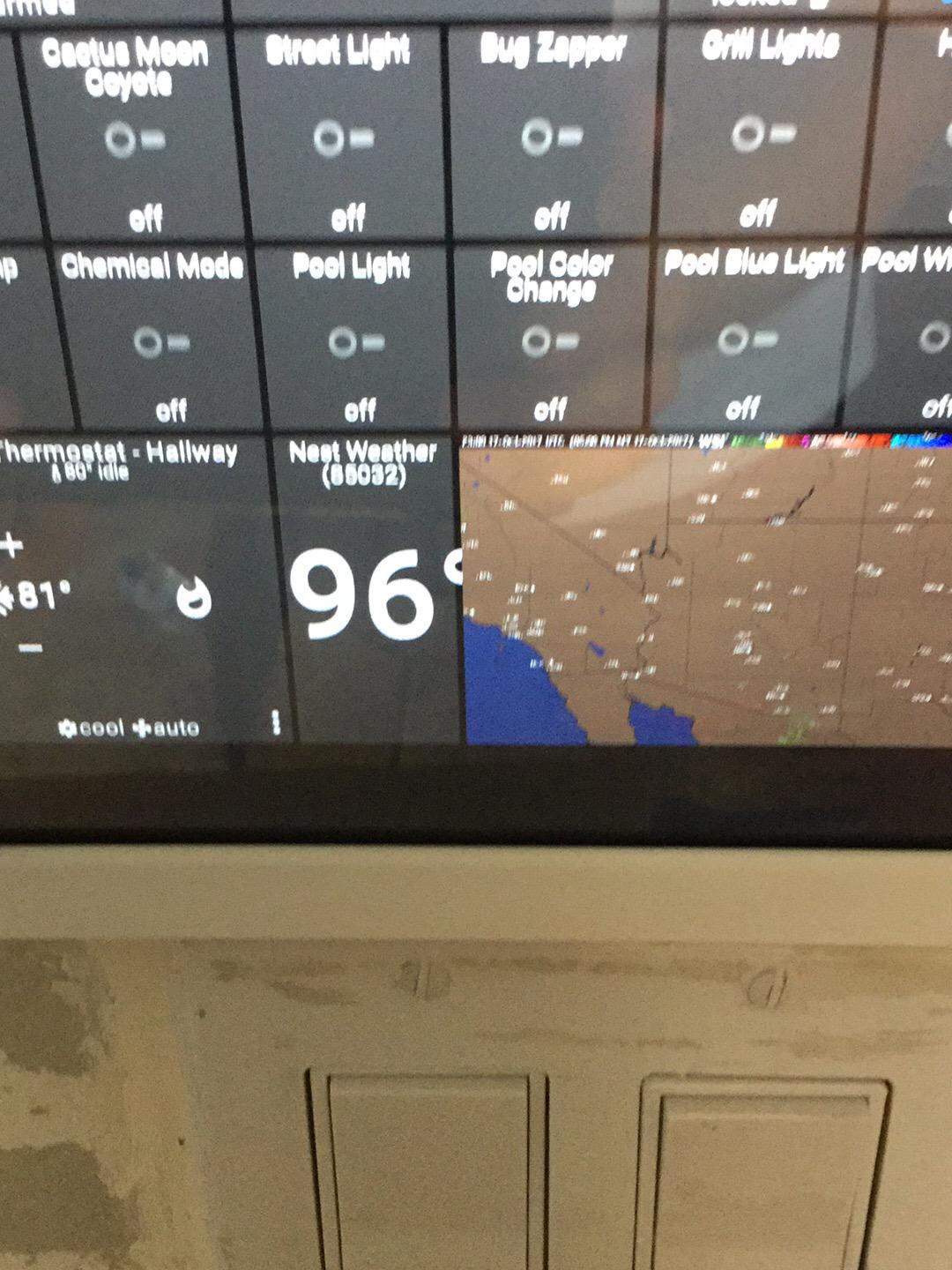

There was a bug with the 1w x 2h Temperature Tile ...
FIXED

Wow guys. Some really nice work here. I have been tinkering with some of the new things .... lots of stuff here. I can't wait for even more color customization to come in the future.

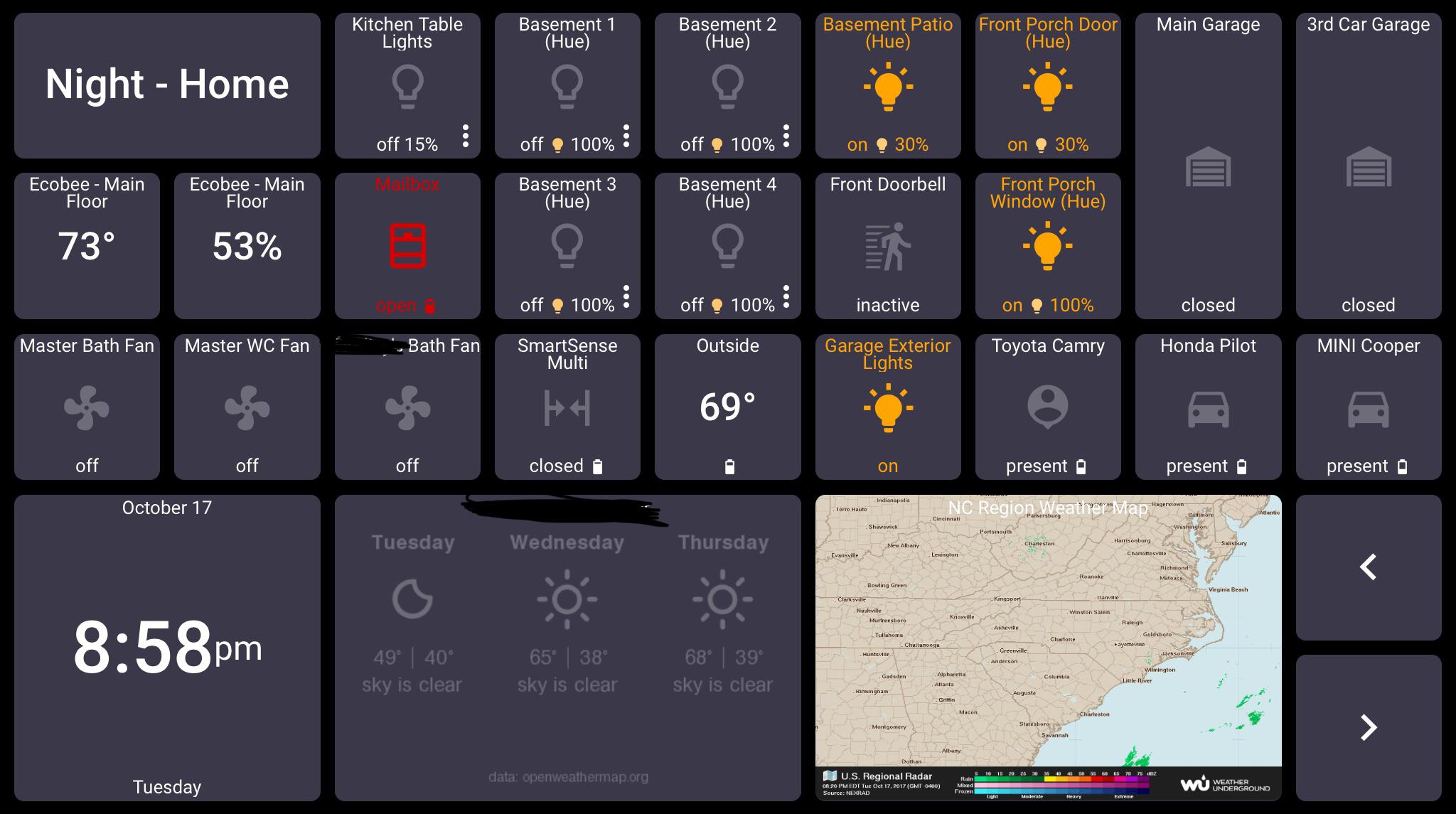
Here is what the clock look like for me.
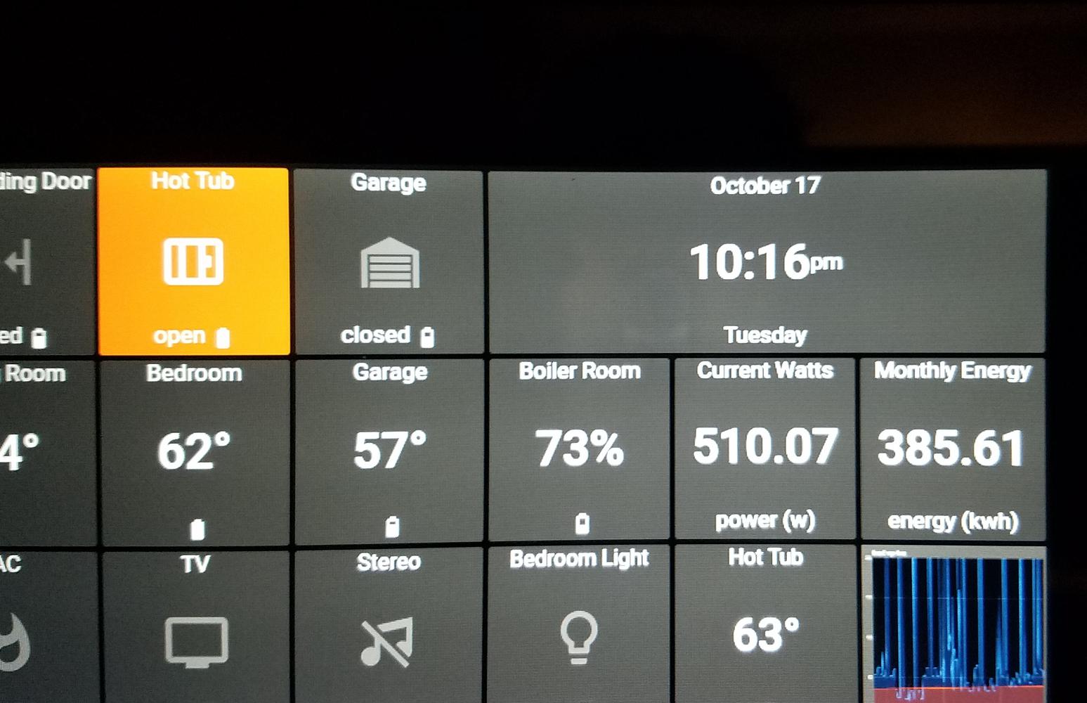
Also is there a way to change the decimal points shown in a value? The text is overlapping the tile now also when the the wattage jumps.

Can you capture a high-watt example, please?
This was an area we dug into in Beta, so I don't want to rush a change.

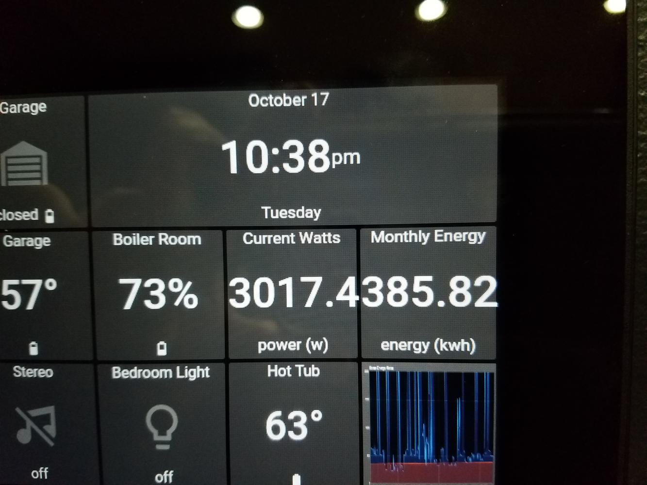
It does actually drop a digit but it runs slightly past the border and looks like one big number.

Nick,
Power and Energy values over 1,000 have 1 decimal place, values over 10,000 have no decimal places. Otherwise the values are rounded off to 2 decimal places.

Just a simple feedback, The text size of the tilesets are too big now and I can't find a place to control it, I only see customizations for the tile, not for the tileset.

The font size of Tileset title will be reduced to 1/8 the size of Tile (down from 1/5). There's no preference to change this.

Thanks for the compliments, your comments and bug reports!
We addressed a number of issues that unfortunately escaped the QA. With the growing number of options, the number of possible combinations to test grows exponentially.
Some fixes have already been deployed, some are pending deployment within the next day. We will monitor and continue to squish bugs as they appear.
If you need any assistance, please don't hesitate to contact support at Support@ActionTiles.com
Thank-you!
Alex and Terry

Really pleased with these improvements... I haven't seen anything "break" for me but I haven't dug deep yet either. The increased font size caused me to reduce my default zoom and font size in Fully Kiosk, but that is fine because that was a work around anyway :-)
Bummed that the iPhone Plus render of a 3x1 weather tile as a 2x1 issue still exists. Seemed like it would be addressed with this update.
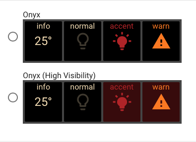
Little itty bitty thing, the style example for Onyx (High Visibility) is the same as regular Onyx.
Thanks

Well, it is in fact different, but I maybe it needs another look at as maybe it does not have enough "High Visibility".

Looks like there is a minor CSS bug/inconsistency with the hover and Tile Corner Radius in the Jet theme (not tested with others). Image below is medium tiles with 6px spacing and 10px radius. The hover colour change seems to be ignoring the new tile radius.
Tried to find the source in the CSS/JS, but couldn't quite confirm. I think the md-ripple-container style needs the border radius added somehow:

I will take a look at that. It will be low priority at this moment as it has very little effect.


Thank you so much for this release, a recent update to Windows and/or Firefox made actiontiles especially with more than one tile having a camera feed perform really badly (it was fine), this new version has been clearly optimised and now works perfectly, add all the theme and setting changes you can make and its a cracking release!

Hi everyone, and thank you for that major update.
I'd like to add a decimal to all my temperature tiles (now only integer values) as it makes a big difference in celsius. How can I achieve that please ?

Hi Christophe,
Please see the open Feature Request Topic for Decimals on Temperature, and add your VOTES .
Thank-you!
Customer support service by UserEcho




Thanks for the compliments, your comments and bug reports!
We addressed a number of issues that unfortunately escaped the QA. With the growing number of options, the number of possible combinations to test grows exponentially.
Some fixes have already been deployed, some are pending deployment within the next day. We will monitor and continue to squish bugs as they appear.
If you need any assistance, please don't hesitate to contact support at Support@ActionTiles.com
Thank-you!
Alex and Terry