
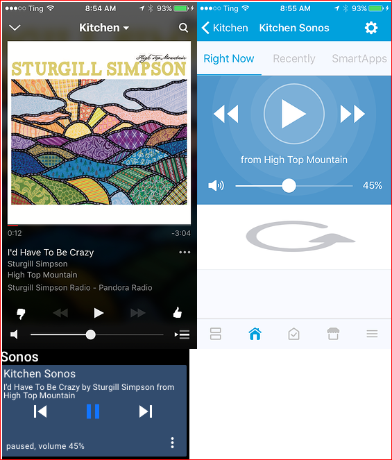
Music or Sonos Player Tile is inconsistent (reverse) of industry standard media control and not intuitive
The AT Sonos tile shows current state of the player where the native Sonos and ST interfaces show what happens if you touch it.
Example - in AT if you have paused your Sonos - the AT tile shows pause. But if you look at the same player in Sonos or ST the image is a play button. You touch it and it plays.
Not being consistent with the "normal" interface can be confusing. Beyond this it is more confusing since it isn't consistent across the 3 buttons on the tile itself. The forward and back buttons do not show state, they show what happens if you touch them. The play/pause/stop button should be the same. Besides - state is shown in the description at the bottom of the tile "stopped, volume 45%"
The following are the Sonos App, SmartThings App, and ActionTiles Music Player Tile
Please consider making this change or making it an option for users to pick how they want it to be for their panel.
Answers


Please just use the Topic Vote button rather than "agreed +1" type Comments. Votes are the one of the strongest drivers in our prioritization of requests ... that's why each forum user gets a "limited budget" of Votes they have to "spend" wisely. 😁
Just to clear up any confusion...
The Music Player Tile was implemented the current way on purpose, in order to be consistent with every other ActionTiles Tile.
Every Tile that is a "control or command Tile" (i.e., is clickable), shows the current State of the Thing, not the next State. For example...
- A Switch that is Off will show that it is Off and tapping it will turn it On and show that it is On.
- A Garage Door that is Open will show that it is Open and tapping it will Close it.
Therefore:
- A Music Player that is Playing will show that it is Playing (▶️) - i.e,. the current State, rather than showing Pause (⏸️), i.e., the next State.
We acknowledge that for Music Player Tile this is not consistent with the User Interfaces of other Apps (though some Apps / Devices use a single "play/pause" icon (⏯️), and show the State separately!

I'm willing to go with a single play/pause button. We already show the current state separately.
Customer support service by UserEcho

Just to clear up any confusion...
The Music Player Tile was implemented the current way on purpose, in order to be consistent with every other ActionTiles Tile.
Every Tile that is a "control or command Tile" (i.e., is clickable), shows the current State of the Thing, not the next State. For example...
Therefore:
We acknowledge that for Music Player Tile this is not consistent with the User Interfaces of other Apps (though some Apps / Devices use a single "play/pause" icon (⏯️), and show the State separately!
Please just use the Topic Vote button rather than "agreed +1" type Comments. Votes are the one of the strongest drivers in our prioritization of requests ... that's why each forum user gets a "limited budget" of Votes they have to "spend" wisely. 😁