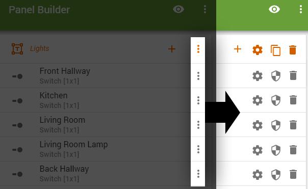
Backend UI Suggestion
If you didn't need to constantly click the vertical dots to access the menu that only has 2 or 3 options it would make bulk editing quicker. Seems like a good way to cut the amount of clicks in half.

Answer

Hi Dank,
This is a reasonable suggestion, but two hurdles will make us hesitate:
- You have expanded the 3 menu items, but the overflow menu also shows Tile Details (name, Location, and Device Type), and we also might add more menu items. We're inclined to retain flexibility and room for growth of options.
- On narrow screens, space on each row is tight and even adding 2 icons may start to run into long Tile Labels (and, again, we might add useful information to each row, such as some of the current Styles applied - who know?).
...Terry.

Good points. Maybe just adding a right click context menu would help speed up configuration on the desktop.

I'm not sure I understand... how would "right-click" option be any more efficient?
(Besides: We avoid using right-click, as the majority of all operations are conducted on Tablets with no right-click operation available, unfortunately).

It wouldn't be a huge improvement but it would give a larger area to access the menu from..rather than a tiny icon, you could click anywhere on the row. I personally prefer making major panel edits on the desktop rather than on mobile. But I guess I'm in the minority.

We do very much encourage folks to take advantage of their desktops or laptops to build and edit Panels, since it certainly is faster (more powerful processor), and you can have multiple windows open ... or even place your Tablet beside you to watch immediate updates.
So, indeed, we will keep in mind ways to make that even more efficient by possibly using right-click, wide screen fold-out controls or whatever. From a development perspective, though, we take some risks by not focusing on consistency in all browsers.
Customer support service by UserEcho


Hi Dank,
This is a reasonable suggestion, but two hurdles will make us hesitate:
...Terry.