- ActionTiles Forum
- Panels (dashboards)
-
 Ideas & Feature Requests

A Panel width Setting to help layout consistency for Panels viewed on different screen sizes
I've been using smarttiles/actiontiles for years now and there's a specific functionality that seems super simple to implement, but remains missing... I'd like to be able to set a maximum panel width, so I can achieve the same flow of tiles on multiple similar sized devices... it could simply center the tiles on screens with larger resolutions, or could scale tiles +/- ~20% to fit the available resolution of the screen... for smaller screens, it would still wrap the tiles of one row into 2 or more, but it's just too much to maintain unique panels for each unique display type... so, for starters, could we at least be able to specify max tile spaces wide for a panel?
Answers

I'm finding that side by side would be great as well. Vote for adding this capability!

Please just use Topic Votes rather "+1" or "agree" comments.

Thanks!!!

Please just use Topic Votes rather "+1" or "agree" comments.
Thanks!!!

Being able to place tilesets side by side would be a BIG plus. Even better would be the ability to define the width of the panel (in # of tiles) and the width of each tileset, and move each tileset to the desired position on the panel. Here's an example of what that would allow me to do (ignore the labels, just consider each different color to be a separate tileset):
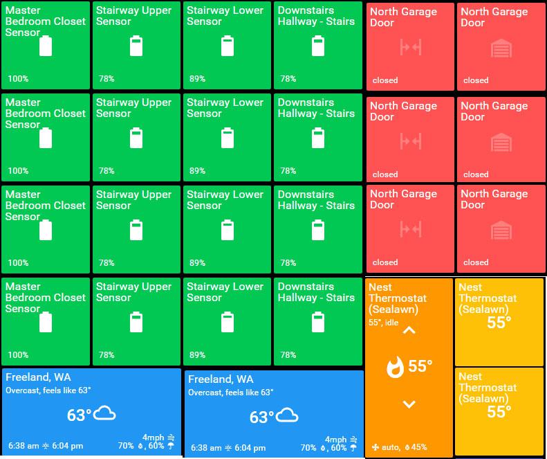
This would have a 4x4 tileset (green), a 3x2 tileset (red), a 1x4 tileset (blue), and a 2x2 tileset (orange/yellow).

With the exception of your thermostat tile, this can already be done. My tilesets are called "Row1", "Row2", etc. (all with title hidden). You can then order your things such that the above setup is duplicated. You just have to be careful that you reorder the tiles so that they line up with the similar ones above or below.
The thermostat title is an issue because it's 1x2. If you put this into "Row4" tileset, there would be no way to put anything on Row5 since Row4 would take up two rows. That's ok if ALL of the tiles in the row are two tiles high because it would still fill your screen.
I think that since one-size-doesn't-fit-all when it comes to user preferences, the only long-term solution is to incorporate two things that would make Actions Tiles super-customizable:
1. Every panel has a "home" location (top left at 0px,0px). Every tile has a absolute location based on the home location, that is, every tile has an X,Y coordinate (top left of that tile).
ALTERNATELY:
1. When editing layout, there is a light grid displayed (based on selected tile size for that panel). The grid has numbers on it, designating possible locations for the top left portion of a tile. Each tile has a configuration for what grid square it begins in. If the tile is, for example, 2x1, it would occupy more than one grid square, making the extra square(s) unavailable for assignment.
2. A user-custom theme is created where every color of every tile in the theme is replaced by a variable. In the settings for each tile, you supply the color that each particular state of the tile is represented by (and color of text).
With these two changes, which are probably rather hard to implement, pretty much all of the requests for layout or color would be resolved. Any tile could go anywhere, wouldn't interfere with other tiles, and could be colored in any way for any condition.

I like the idea of side-by-side Tilesets and varying sizes. Playing around I was able to do something similar but with separate panels. This is using Firefox and the Tile Tabs extension.
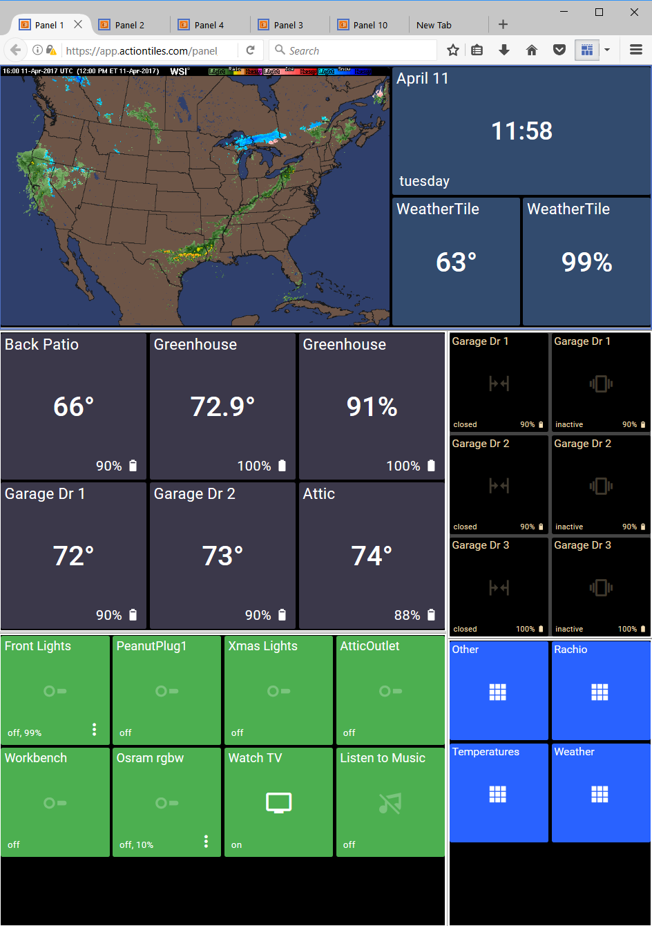
This definitely shows the power of browser extensions, doesn't it?! Wow!
One non-technical challenge we have is to drive more traffic to this Feedback Forum so that we get a diverse and accurate understanding of what Features to prioritize. Some stuff is much easier to implement than others; but we would gladly put aside a lot of low-value improvements and focus on the more valued ones ... if we are convinced it will help us attract customers and convince them to purchase after the Trial!

anyone know if there is a similar extension for chrome? quick search didn't find it. Thanks!
This, Please so much this. I would love to be able to fill my screen and have it work much more as a control panel for the whole house as well as being able to see statuses at a glance.
Hi Brent,
I don't often allocate 3 of my own Votes to a Feature Request, but this exact idea has been on my mind for the past 2 weeks...
The Panel rendering engine automatically scales / adjusts the Tile Size to responsively fill the entire width of the browser window. This is convenient for the purpose of automatically optimizing the view when switching resolution, orientation, or resizing a desktop browser... But, indeed, results in different or "broken" layout appearance of the same Panel for Customers with different sized Tablets in their homes.
The lack of a width option also prevents the customer from optimizing the layout to prevent vertical overflow / cutoff / scrolling of the bottom row' because setting the Tile Size smaller is overridden to be automatically scaled up to fill the physical browser width; the height is not given any consideration by the rendering engine.
Alex & I will chat about this Idea ... Thanks for posting it!
Thanks,
... Terry.

Just curious if there has been any movement on incorporating this feature? I'm using a Nexus 9 tablet and a Lenovo 10" tablet. If I could lock the layout of the Nexus 9 to be used on the Lenovo 10 it would provide a great, consistent layout.
Am loving ActionTiles!

I have also allocated 3 of my votes to this.
I was thinking about it for some time and we need to discuss this and prioritize.
Rather than a +1 comment, Weston; please allocate Topic Votes using the Vote button on the original post:
Thank-you!

Please enable this. I would love to arrange "Tilesets" side by size while still having labels. That way, I can use a tablet in landscape mode and have the tilesets arranged horizontally) and vertically.
Please just use Topic Votes (rather than "+1" or "agree" comments).
Comments are welcome if they add value to the discussion: i.e., variations, compromise ideas, or special use cases.
Thanks!!!
One challenge with this option is that a "screen height" (i.e., number of rows) would have to be specified by the customer: The existing CSS container has its width determined by the physical screen and resolution, but the height is infinite (via scrolling).
Or would you want that to swap too... i.e., "infinite" horizontal scrolling?

I'm also giving this 3 votes, I'm just running into this as I have a Fire 7 and an 8 and I can't use the same panels on both if I want things to look good. Seems like having a fluid layout and using percentages could make this work across any device. The full width is 100% and you assign percentages to tiles to fill the remaining space, instead of something like 1/2/3. Probably with some sane limits so people don't start setting things to 1% and wonder why it looks like crap! Anyway, hopefully this can be improved.

As a brand new user just setting up his first panels, I'm wondering it their is some kind of width option or setting yet? Thank you.
Not yet, Minwild.
The best hint we can give you is to do your layout on a desktop/laptop. Add a row of Tiles and the manually drag the width of your browser until it matches the width of your intended Tablet (by seeing that they start wrapping the Tiles at the same number of Tiles across).
If you want the grid to have more or fewer Tiles across, then try a different Tile Size dimension setting in Panel Settings / Appearance / Dimensions.

My current approach to making a panel work across multiple displays is to design it for one in particular. I then call it from inside a good old-fashioned FRAMESET document (I could, of course, use an IFRAME instead). I top it with:
<meta name="mobile-web-app-capable" content="yes">
<meta name="viewport" content="width=device-width, initial-scale=1.0" id="metaviewport">
Assuming the display it was designed for has a width of 1280, I then follow that up with:
<script>
    var metaviewport = document.getElementById('metaviewport');
    function setviewport()
    {
        var initialscale = screen.width / 1280;
        metaviewport.setAttribute( 'content', 'width=device-width, initial-scale=' + initialscale );
    }
    setviewport();
    window.addEventListener('resize', setviewport);
</script>
Generally speaking that works to scale it to fit the width of whatever display you use, though you are in the hands of aspect ratios as to how much fits on the screen vertically. It doesn't work on one small phone when I use it in landscape mode so there might be a rounding issue coming in to play.
Continuing the general theme of the various combined threads, there is a cosmetic issue that comes into play when you are working with panels that are higher than your screen height, and that can be particularly noticeable when your panel is sharing screen space.
Assuming you haven't removed the spacing between tiles, a panel will be displayed such that there is a 'gutter' around the edge of the panel that matches the spacing between the tiles, and very neat it looks too. However if your panel overflows the display you don't see the gutter at the bottom of the screen, you just get a row of tiles cut off in the middle. Similarly if you scroll down the panel you lose the gutter at the top.
I personally think it would look better if the 'gutter' was always present on all sides, effectively being a frame that the panel scrolled within. It would give consistency to the panel's relationship with its surroundings.
It is particularly noticeable when you want to display a panel inside something else. For example I nest panels inside other panels using iframes and in their initial state you can't see the join. However if the panel is bigger than the iframe it is displayed inside and you scroll it down the gutter gets lost.
On a related note, is there an argument for scroll snapping by row of tiles?

Any news on this? It should be really trivial to make AT responsive so that you tell it how many columns you want and then it all works with percentages instead of absolute values. This sort of thing should be default nowadays, really.
We appreciate the value and popularity of this Feature Request and are looking forward to improving the layout engine in various ways. We are taking into account the complexity and risks of implementation.
P.S.:
Here's an annoyance that I have no qualms expressing: Please avoid assuming that any work is "trivial" (though, TBH, I sure have used the same term regarding other vendors' missing or proposed bug or features from time to time).
Calling a Feature or Bug "trivial" is an unintentional slur - Labeling a Feature "trivial" is loaded with an unfortunate unavoidable implication that we are not sufficiently competent to implement it or are incorrectly prioritizing it.
Only we can and will make the determination of triviality or complexity - please & thanks 🙂!
Please reference: When are Feature Ideas in the Forum going to be implemented?
Thank-you,
...Terry.
Apologies if I've caused offence. But as someone with a bit of experience in front end work, that's how it feels to me. This is a commercial product that I've paid for so I think I should be able to be honest about how I see it. If it was open source and you were doing it in your spare time out of the goodness of your heart then I might not have phrased it the same.
No problem, AndyJ... I appreciate your thoughts!
We wouldn't be running a public feedback forum if we didn't want honest feedback from diverse customers. My personal philosophy is that it works both ways. It would be disingenuous of me to say that every Feature Request is "wonderful", and agree with those which are called trivial and just say "we'll get right on it!". That would not be honest. We want lots more folks to love ActionTiles and we know there's lots of opportunities for improvement. We also don't want our effort literally "trivialized". A trivial product doesn't command a fair price. You paid for ActionTiles without this feature. If it were trivial for us to add it, then it would probably already be in the product.
We transparently emphasize that Customers should buy ActionTiles for what it does now -- not for what it may do someday, and not with the hope that any particular feature request will be added soon or ever. This ensures we aren't promise-breakers. We never promise anything until it is very close to actually being delivered, regardless of our optimism that some stuff will turn out to be easy to implement.
If we acknowledge that any particular Feature is "trivial", it has the side-effect of making it seem that we have already conducted the necessary scoping, research and proof-of-concept development. We have more than enough experience to know that most things are not as easy as they seem.
Anyhow - enough overthinking it, right? It's more important that we encourage feedback then criticize particular wording. Simple fact is that we agree this feature (among others) would be valuable. We hope our continuing feedback solicitation, market and development research helps us continuously provide the most value for the most customers.
Thanks,
...Terry.
Yep, agree.... and don't get me wrong, I think ActionTiles is a fantastic solution in the market at the moment. As a UX person responsible for the UX on a site with millions of visitors a month and over 5 million "members", I probably see things a bit differently. We get feedback sent through regularly and if we implemented every feature then we'd end up with a completely unusable product. But I don't see having a product that works beautifully across multiple devices, landscape or portrait, etc, as a "feature". It's something that will provide an intangible value to all customers.

ok...so what happened to this? it is moving forward? I am happy to allocate some votes to it. I have smartphone, old Samsung tablet and Nvidia Shield driving a 4K Samsung TV and don't really want to have to design panels for all 3.
Otherwise I am really liking the product and will probably sign up for the Paid version soon. Thanks for all the great work.

Customer support service by UserEcho

I have also allocated 3 of my votes to this.
I was thinking about it for some time and we need to discuss this and prioritize.
Hi Brent,
I don't often allocate 3 of my own Votes to a Feature Request, but this exact idea has been on my mind for the past 2 weeks...
The Panel rendering engine automatically scales / adjusts the Tile Size to responsively fill the entire width of the browser window. This is convenient for the purpose of automatically optimizing the view when switching resolution, orientation, or resizing a desktop browser... But, indeed, results in different or "broken" layout appearance of the same Panel for Customers with different sized Tablets in their homes.
The lack of a width option also prevents the customer from optimizing the layout to prevent vertical overflow / cutoff / scrolling of the bottom row' because setting the Tile Size smaller is overridden to be automatically scaled up to fill the physical browser width; the height is not given any consideration by the rendering engine.
Alex & I will chat about this Idea ... Thanks for posting it!
Thanks,
... Terry.